Market Landscape
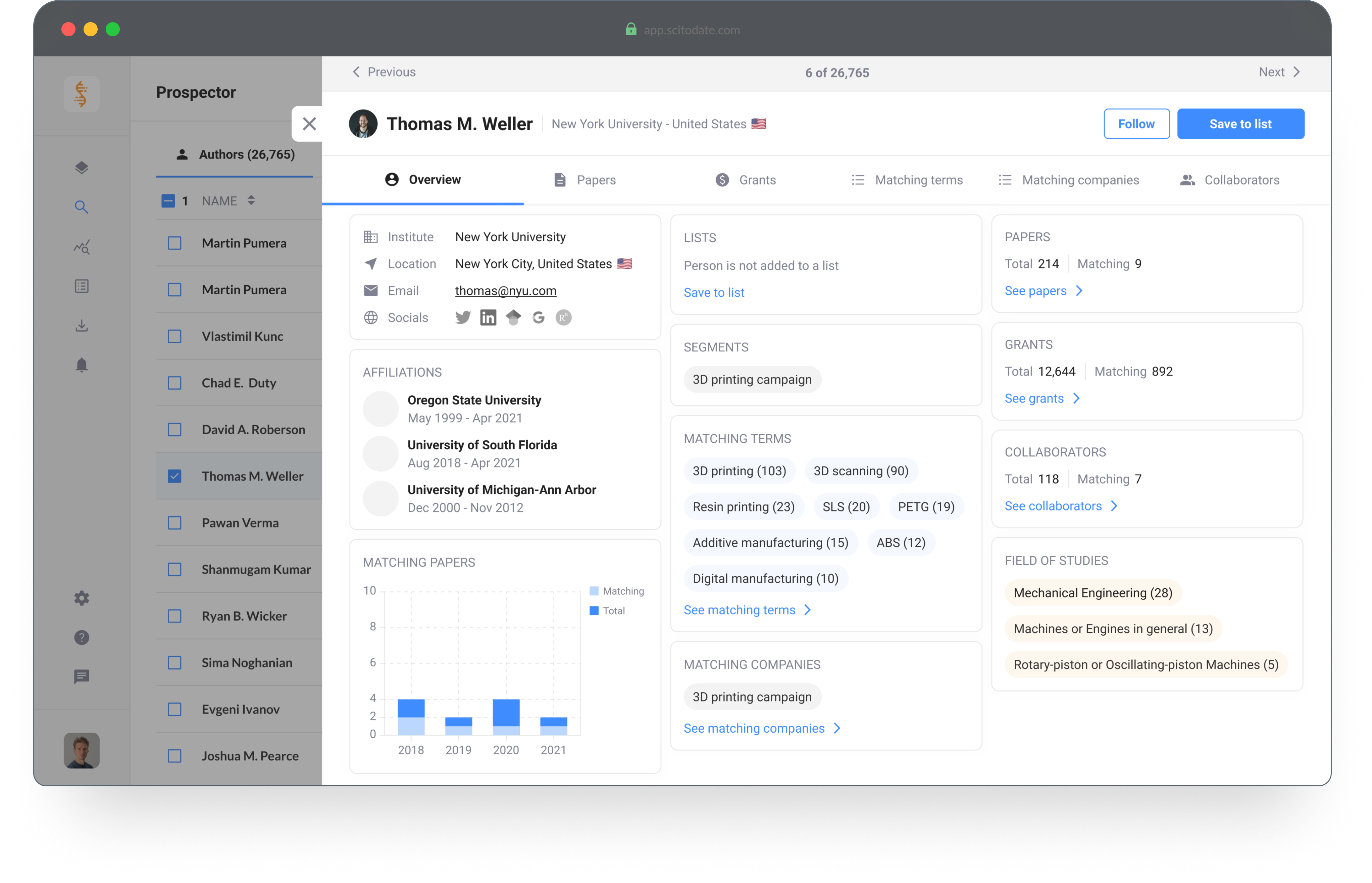
Platform for Marketing and Sales professionals. The tool enables you to analyze trends and find targeted leads within the scientific market.
Introduction
As a marketing or sales professional it's important to generate high conversion rates and find valuable leads for your next campaign. Market Landscape has millions of data points regarding the scientific market and provides you with the tools to analyze market trends and opportunities, identify the ideal customers and create hyper-targeted campaigns.
Company
Scitodate B.V.
Role
scitodate.com
Status
Finished
Role
Product Designer
Tools
Figma, Illustrator and ProtoPie
Design Brief
Target Group
The target group for this tool consists of Product Managers and Marketing Professionals.
Bottlenecks, goals and needs
- Save time on lead generation & qualification
- Increase their conversion rates
- Create targeted campaigns
- Easy access to contact details of new and existing customers

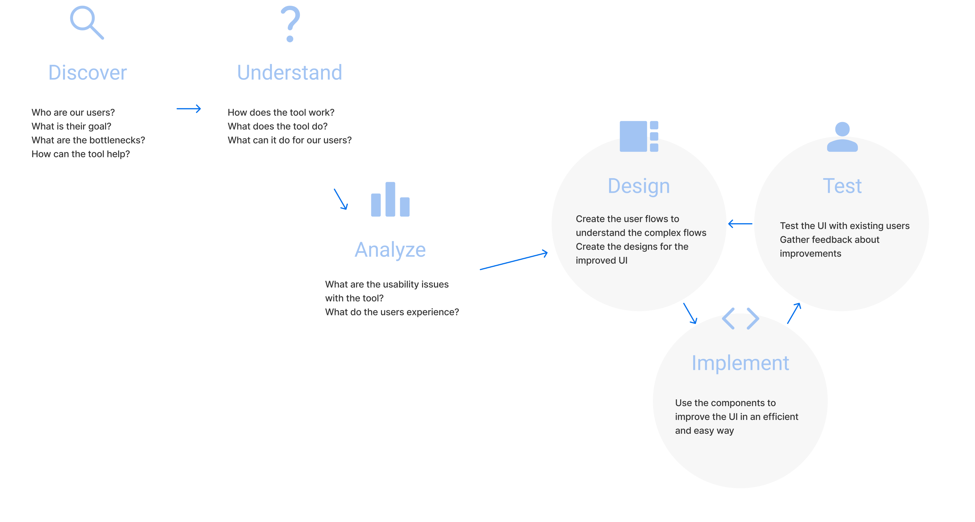
Discover and Understand
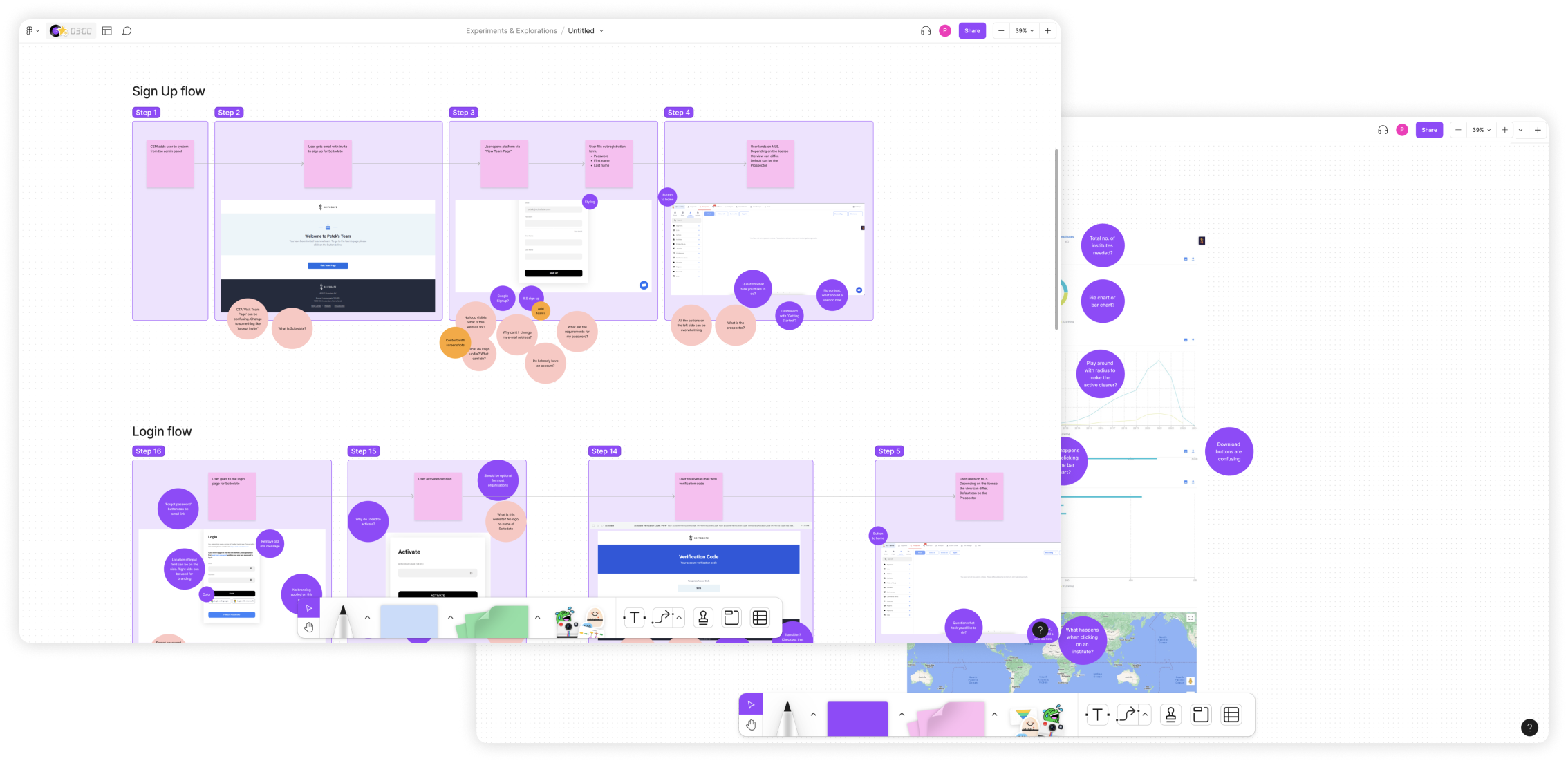
When I started at Scitodate, Market Landscape was already built and in use. My initial task was to discover and understand our users.
Next to understanding the user group, I analyzed the usability bottlenecks that occurred within the different flows in the tool.
Design Improvements
Based on the initial discovery and analysis phases, the design improvements were focused on the following three points.
1. Improve the usability
The usability of the platform was significantly complex. My responsibility was to analyze the flows and to improve the usability of the different features.
2. Make it less overwhelming
First time users felt overwhelmed after logging in to the platform. There was no onboarding or logical flow to explore and understand the platform.
3. Re-use components
The platform was built out of components from the Material Design library. My task was to (re) use the components from the same library.
Design Changes
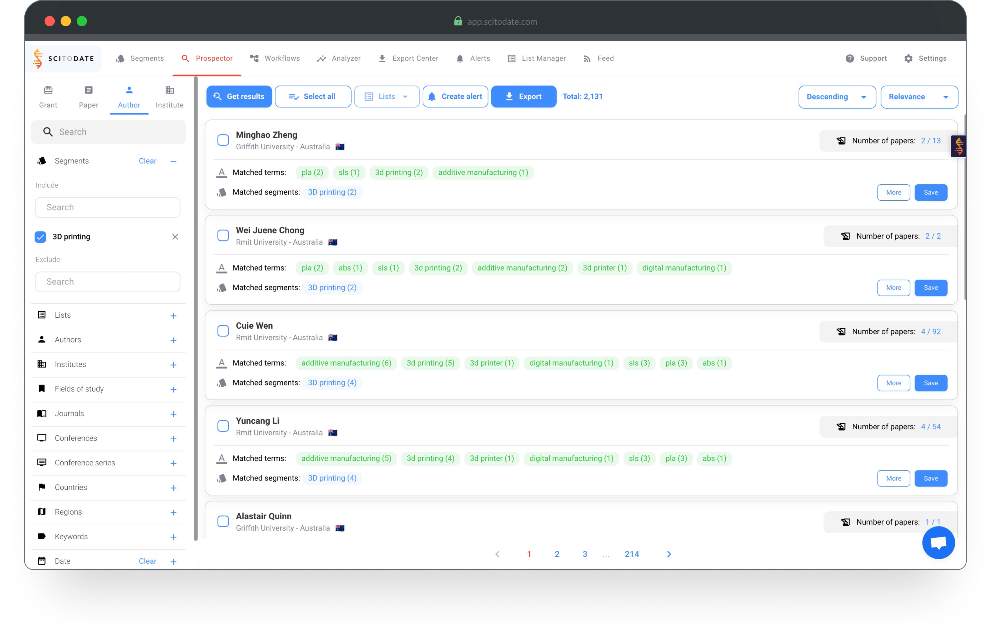
Initial design analysis | Search results
- The filters on the left are always visible
- The overview looks busy and feels overwhelming
- Users don't understand how to start finding results
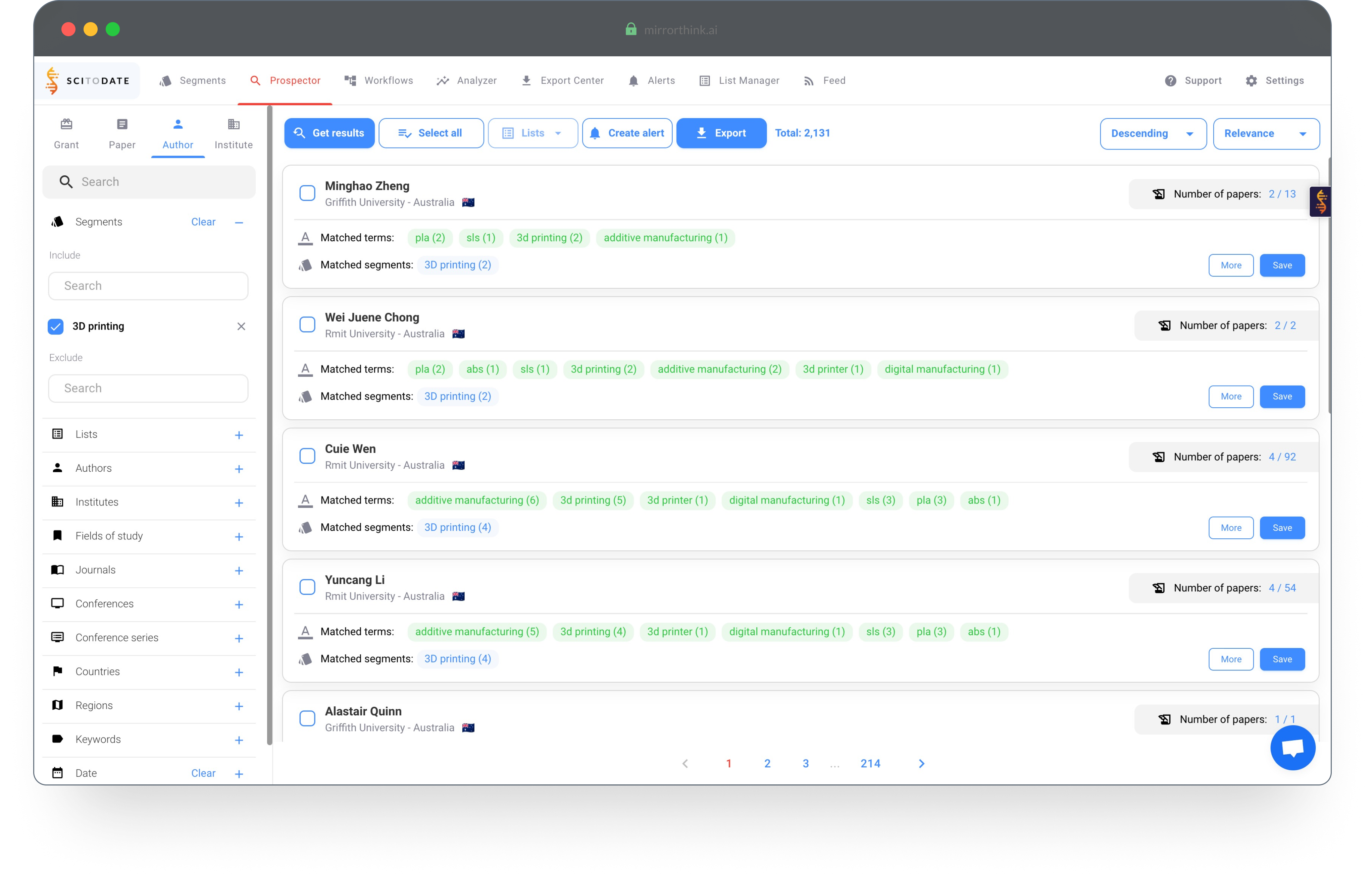
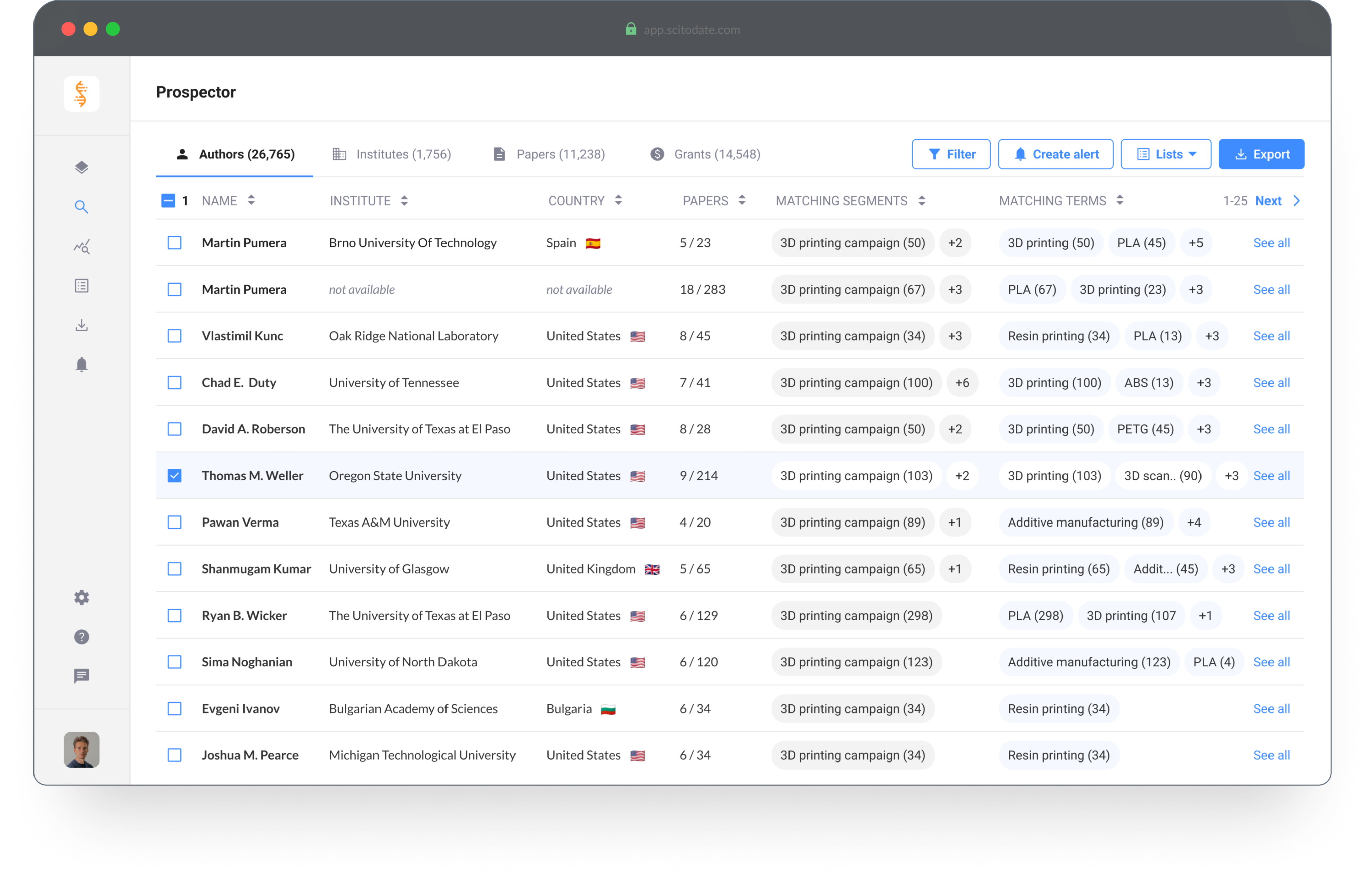
Design improvements | Search results
- The filters are less intrusive and accessible when needed
- The table view makes it easy to scan the results
- Not everything is visible to create focus for the user
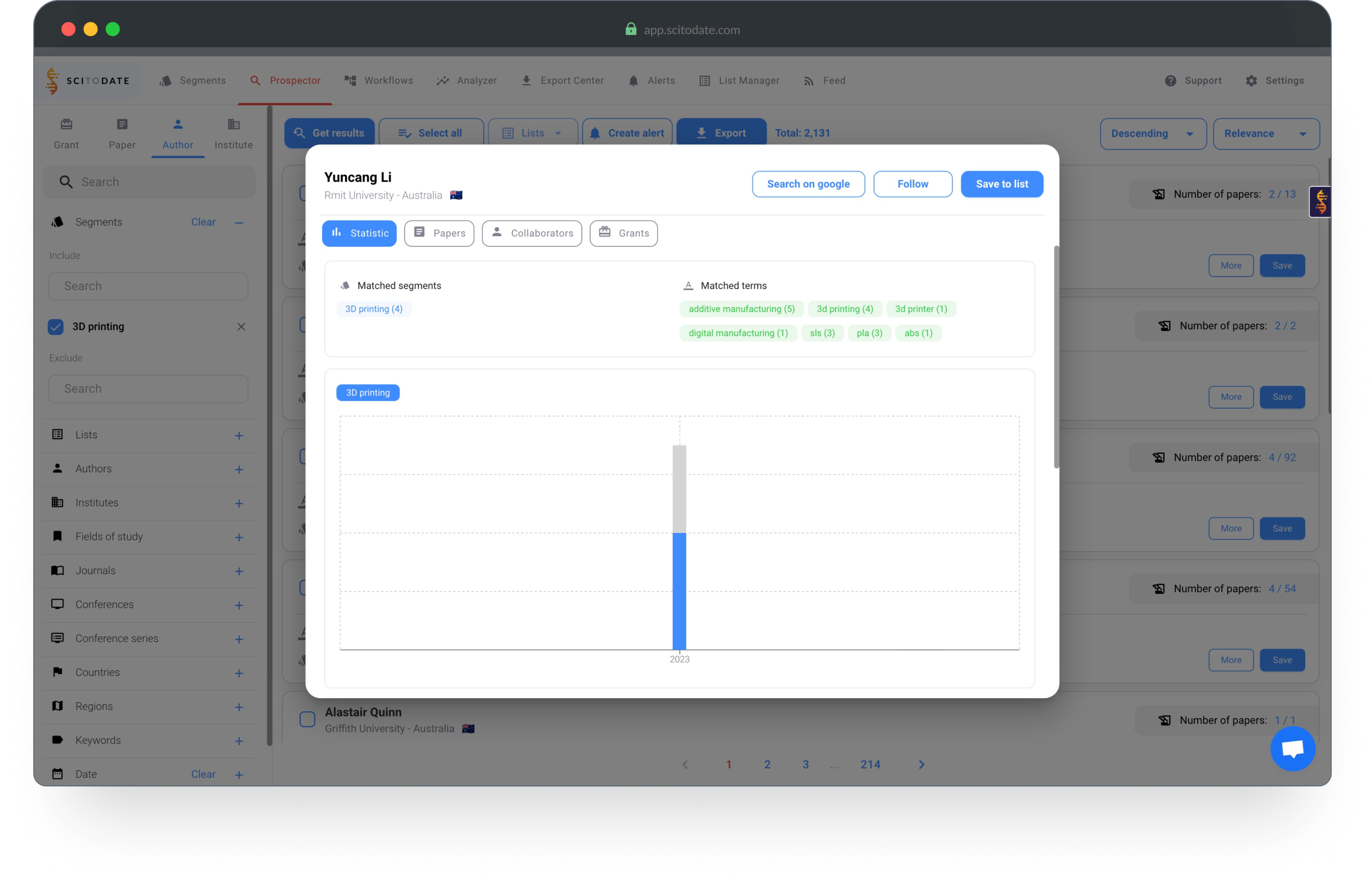
Initial design analysis | Scientist profile
- The initial tab with information does not summarize the important data
- It's not clear how to find more information about the authors
- The design does not make it easy to scan information

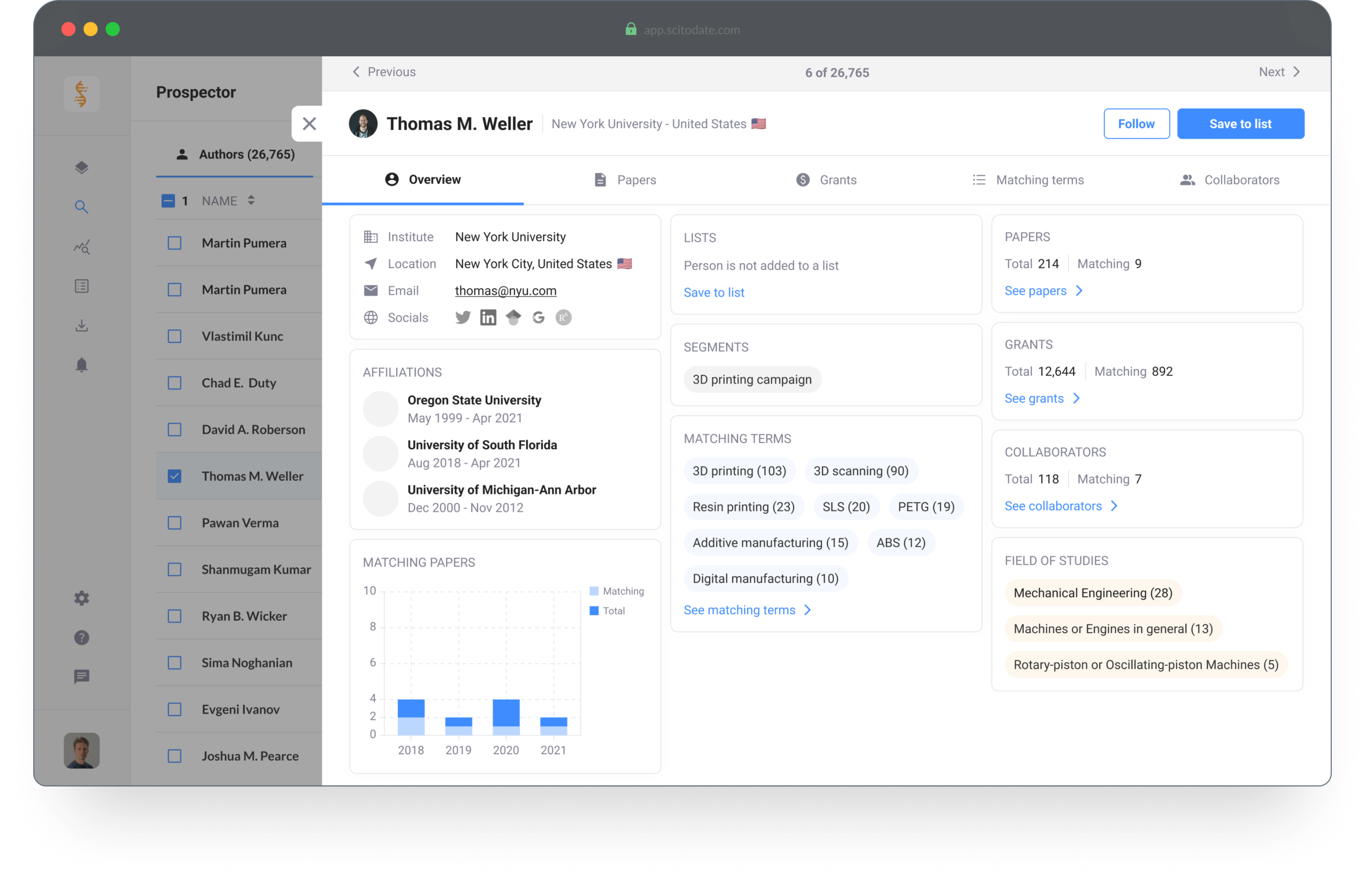
Design improvements | Scientist profile
- The overview tab summarizes the relevant information
- More information is available for the user
- The information is clearly presented and easy to scan

Initial design analysis | Segment creator
- The page does not make it clear where to start
- It's not clear how to create and test a segment
- Not all settings need to be available at all times

Design improvements | Segment creator
- The page is divided to create focus for creating and testing the segment
- Extra descriptions are added for a better understanding of the tool
- Advanced settings are hidden to create focus for first time users

© 2025 Petek Tezcan. All rights reserved.
Market Landscape
Platform for Marketing and Sales professionals. The tool enables you to analyze trends and find targeted leads within the scientific market.

Introduction
As a marketing or sales professional it's important to generate high conversion rates and find valuable leads for your next campaign. Market Landscape has millions of data points regarding the scientific market and provides you with the tools to analyze market trends and opportunities, identify the ideal customers and create hyper-targeted campaigns.
Company
Scitodate B.V.
Role
scitodate.com
Status
Finished
Role
Product Designer
Tools
Figma, Illustrator and ProtoPie
Design Brief

Target Group
The target group for this tool consists of Product Managers and Marketing Professionals.
Bottlenecks, goals and needs
- Save time on lead generation & qualification
- Increase their conversion rates
- Create targeted campaigns
- Easy access to contact details of new and existing customers

Discover and Understand
When I started at Scitodate, Market Landscape was already built and in use. My initial task was to discover and understand our users.
Next to understanding the user group, I analyzed the usability bottlenecks that occurred within the different flows in the tool.

Design Improvements
Based on the initial discovery and analysis phases, the design improvements were focused on the following three points.
1. Improve the usability
The usability of the platform was significantly complex. My responsibility was to analyze the flows and to improve the usability of the different features.
2. Make it less overwhelming
First time users felt overwhelmed after logging in to the platform. There was no onboarding or logical flow to explore and understand the platform.
3. Re-use components
The platform was built out of components from the Material Design library. My task was to (re) use the components from the same library.
Design Changes
Initial design analysis | Search results
- The filters on the left are always visible
- The overview looks busy and feels overwhelming
- Users don't understand how to start finding results

Design improvements | Search results
- The filters are less intrusive and accessible when needed
- The table view makes it easy to scan the results
- Not everything is visible to create focus for the user

Initial design analysis | Scientist profile
- The initial tab with information does not summarize the important data
- It's not clear how to find more information about the authors
- The design does not make it easy to scan information

Design improvements | Scientist profile
- The overview tab summarizes the relevant information
- More information is available for the user
- The information is clearly presented and easy to scan

Initial design analysis | Segment creator
- The page does not make it clear where to start
- It's not clear how to create and test a segment
- Not all settings need to be available at all times

Design improvements | Segment creator
- The page is divided to create focus for creating and testing the segment
- Extra descriptions are added for a better understanding of the tool
- Advanced settings are hidden to create focus for first time users

© 2025 Petek Tezcan. All rights reserved.
Market Landscape
Platform for Marketing and Sales professionals. The tool enables you to analyze trends and find targeted leads within the scientific market.

Introduction
As a marketing or sales professional it's important to generate high conversion rates and find valuable leads for your next campaign. Market Landscape has millions of data points regarding the scientific market and provides you with the tools to analyze market trends and opportunities, identify the ideal customers and create hyper-targeted campaigns.
Company
Scitodate B.V.
Website
scitodate.com
Status
Finished
Role
Product Designer
Tools
Figma, Illustrator and ProtoPie
Design Brief

Target Group
The target group for this tool consists of Product Managers and Marketing Professionals.
Bottlenecks, goals and needs
- Save time on lead generation & qualification
- Increase their conversion rates
- Create targeted campaigns
- Easy access to contact details of new and existing customers

Discover and Understand
When I started at Scitodate, Market Landscape was already built and in use. My initial task was to discover and understand our users.
Next to understanding the user group, I analyzed the usability bottlenecks that occurred within the different flows in the tool.

Design Improvements
Based on the initial discovery and analysis phases, the design improvements were focused on the following three points.
1. Improve the usability
The usability of the platform was significantly complex. My responsibility was to analyze the flows and to improve the usability of the different features.
2. Make it less overwhelming
First time users felt overwhelmed after logging in to the platform. There was no onboarding or logical flow to explore and understand the platform.
3. Re-use components
The platform was built out of components from the Material Design library. My task was to (re) use the components from the same library.
Design Changes
Initial design analysis | Search results
- The filters on the left are always visible
- The overview looks busy and feels overwhelming
- Users don't understand how to start finding results

Design improvements | Search results
- The filters are less intrusive and accessible when needed
- The table view makes it easy to scan the results
- Not everything is visible to create focus for the user

Initial design analysis | Scientist profile
- The initial tab with information does not summarize the important data
- It's not clear how to find more information about the authors
- The design does not make it easy to scan information

Design improvements | Scientist profile
- The overview tab summarizes the relevant information
- More information is available for the user
- The information is clearly presented and easy to scan

Initial design analysis | Segment creator
- The page does not make it clear where to start
- It's not clear how to create and test a segment
- Not all settings need to be available at all times

Design improvements | Segment creator
- The page is divided to create focus for creating and testing the segment
- Extra descriptions are added for a better understanding of the tool
- Advanced settings are hidden to create focus for first time users

© 2025 Petek Tezcan. All rights reserved.
Market Landscape
Platform for Marketing and Sales professionals. The tool enables you to analyze trends and find targeted leads within the scientific market.

Introduction
As a marketing or sales professional it's important to generate high conversion rates and find valuable leads for your next campaign. Market Landscape has millions of data points regarding the scientific market and provides you with the tools to analyze market trends and opportunities, identify the ideal customers and create hyper-targeted campaigns.
Company
Scitodate B.V.
Website
scitodate.com
Status
Finished
Role
Product Designer
Tools
Figma, Illustrator and ProtoPie
Design Process

Target Group
The target group for this tool consists of Product Managers and Marketing Professionals.
Bottlenecks, goals and needs
- Save time on lead generation & qualification
- Increase their conversion rates
- Create targeted campaigns
- Easy access to contact details of new and existing customers

Discover and Understand
When I started at Scitodate, Market Landscape was already built and in use. My initial task was to discover and understand our users.
Next to understanding the user group, I analyzed the usability bottlenecks that occurred within the different flows in the tool.

Design Improvements
Based on the initial discovery and analysis phases, the design improvements were focused on the following three points.
1. Improve the usability
The usability of the platform was significantly complex. My responsibility was to analyze the flows and to improve the usability of the different features.
2. Make it less overwhelming
First time users felt overwhelmed after logging in to the platform. There was no onboarding or logical flow to explore and understand the platform.
3. Re-use components
The platform was built out of components from the Material Design library. My task was to (re) use the components from the same library.
Design Changes
Initial design analysis | Search results
- The filters on the left are always visible
- The overview looks busy and feels overwhelming
- Users don't understand how to start finding results
Design improvements | Search results
- The filters are less intrusive and accessible when needed
- The table view makes it easy to scan the results
- Not everything is visible to create focus for the user

Initial design analysis | Scientist profile
- The initial tab with information does not summarize the important data
- It's not clear how to find more information about the authors
- The design does not make it easy to scan information
Design improvements | Scientist profile
- The overview tab summarizes the relevant information
- More information is available for the user
- The information is clearly presented and easy to scan
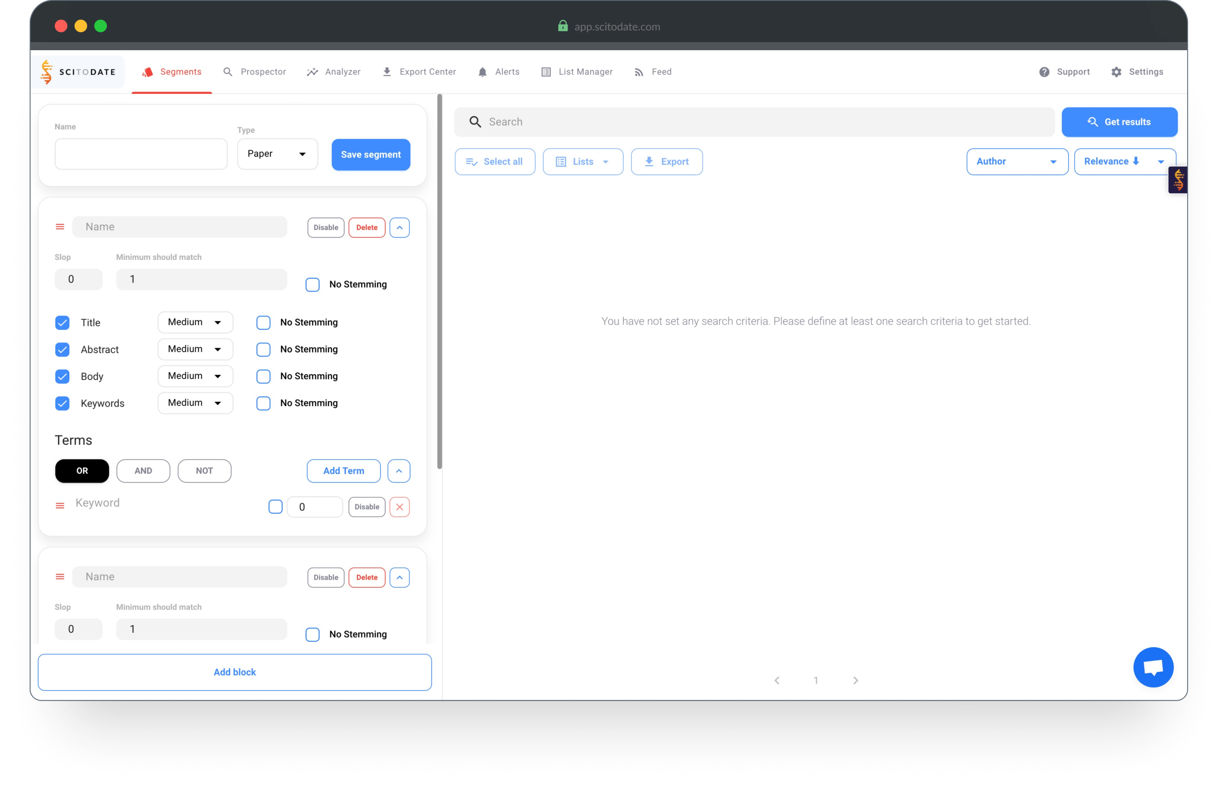
Initial design analysis | Segment creator
- The page does not make it clear where to start
- It's not clear how to create and test a segment
- Not all settings need to be available at all times
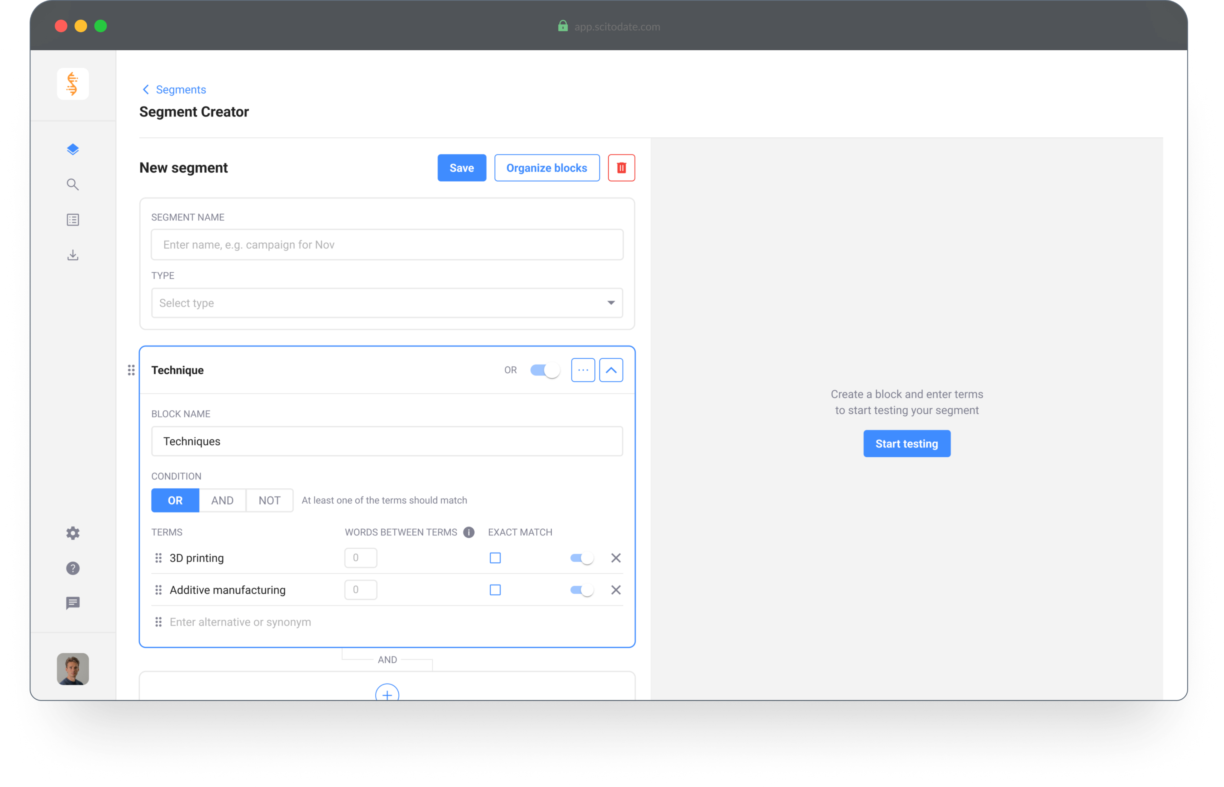
Design improvements | Segment creator
- The page is divided to create focus for creating and testing the segment
- Extra descriptions are added for a better understanding of the tool
- Advanced settings are hidden to create focus for first time users
© 2025 Petek Tezcan. All rights reserved.
