Stichting Emovere
Organization focused on creating emotional awareness, with the goal of recovering inexplicable pain complaints
Organization focused on creating emotional awareness, with the goal of recovering inexplicable pain complaints

Stichting Emovere is a non-profit organization dedicated to helping people understand the emotional side of ongoing physical (pain) complaints, with the goal of supporting recovery and preventing chronic suffering. Their approach is built around three strategic pillars: Inspiratie (Inspiration), Verdieping (Deepening), and Verbinding (Connection). These pillars guide all of their activities, from raising awareness and sharing knowledge to fostering a supportive community.
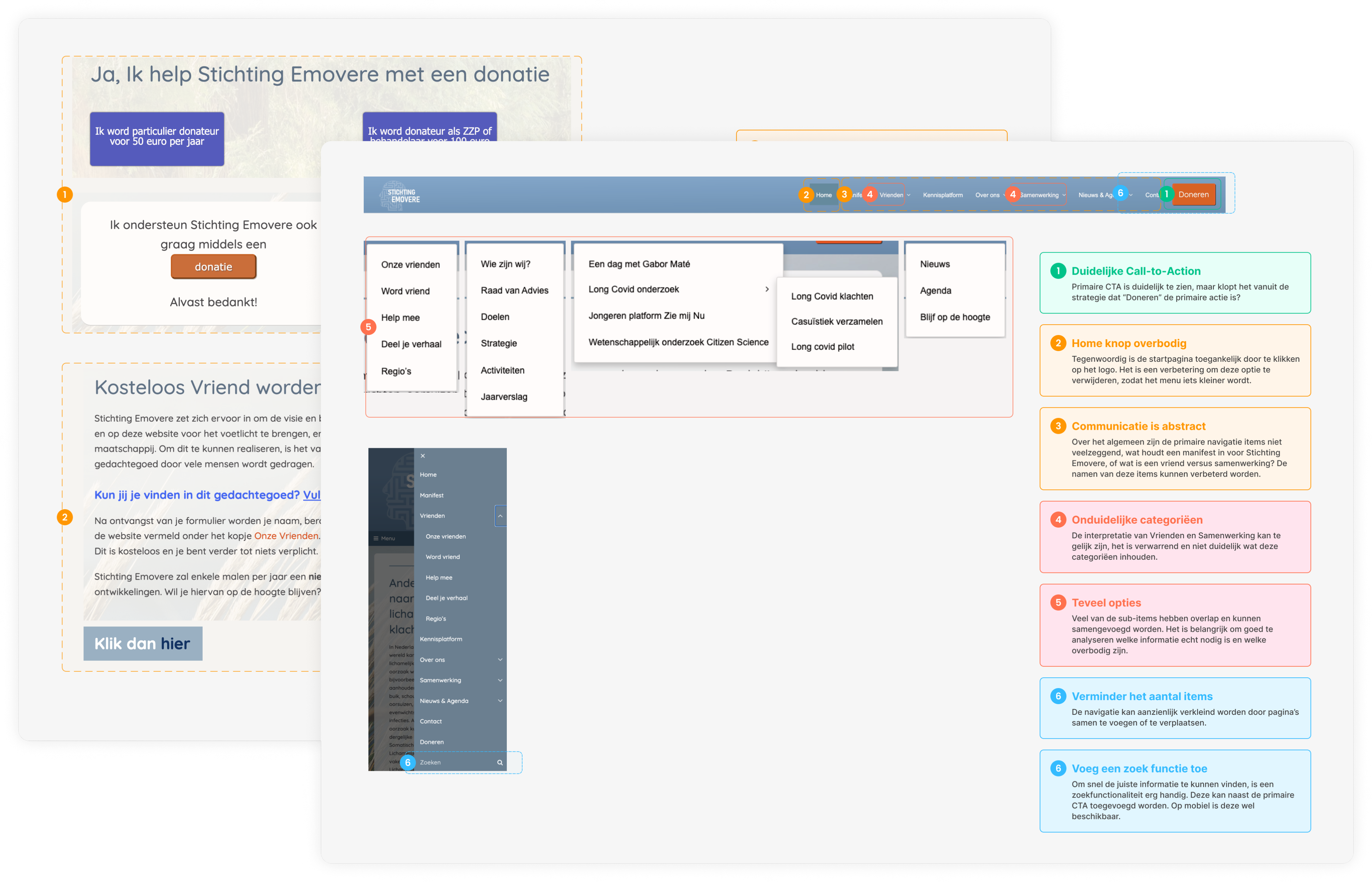
I started the process with a UX audit to identify the usability issues of the website. The findings were used to define the design improvements that needed to be made.
Key takeaways
After the audit, I defined the target group and customer journeys in collaboration with the director of Stichting Emovere. This helped to understand who the website is for and what they need from it.
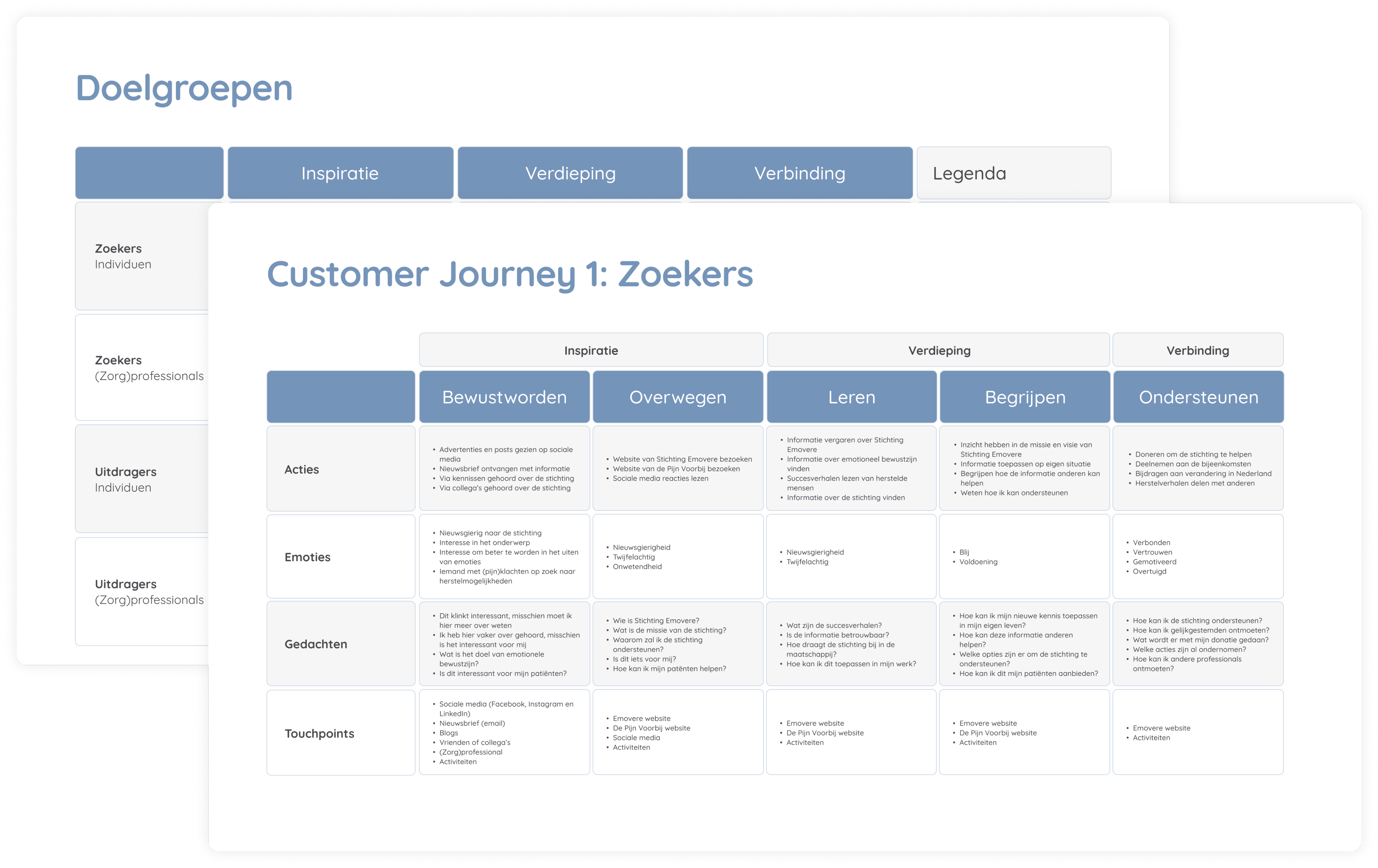
Based on the UX Audit, research about the target group, creating the customer journeys and identifying the most important design opportunities, I defined three main design improvements.
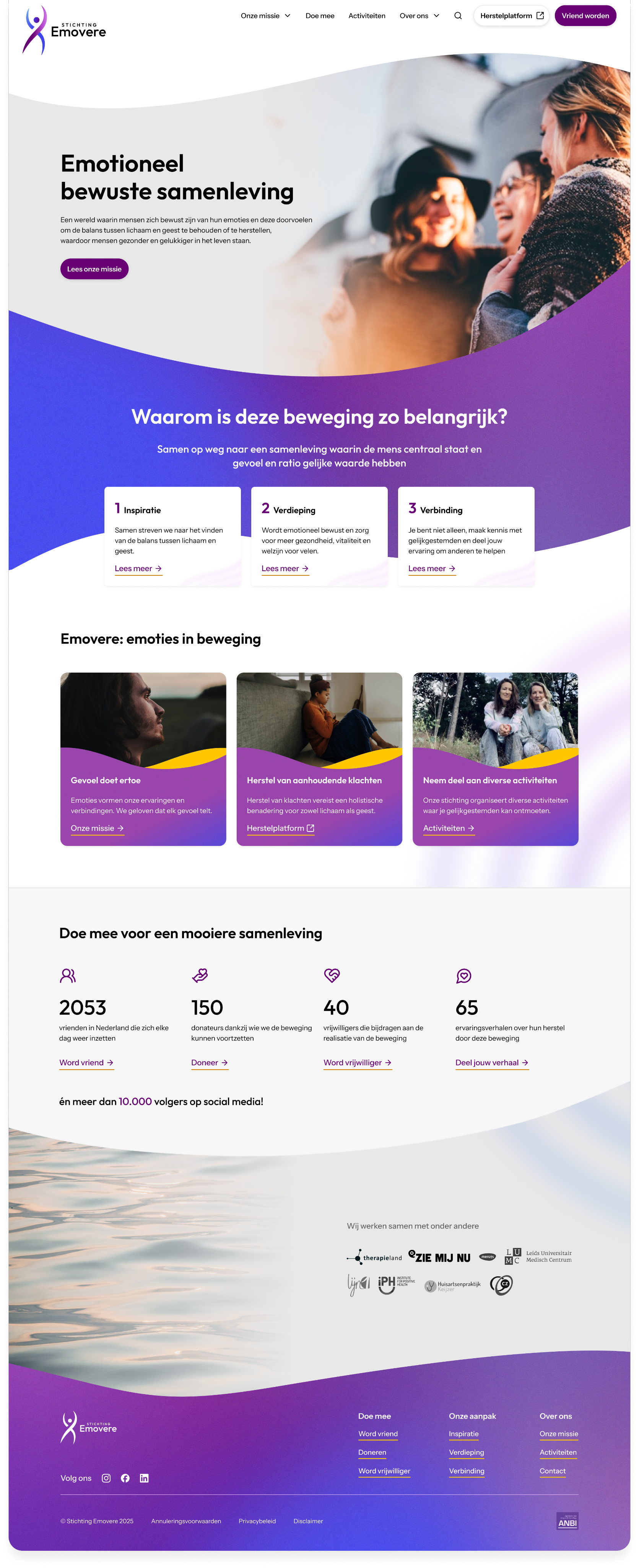
Simplification
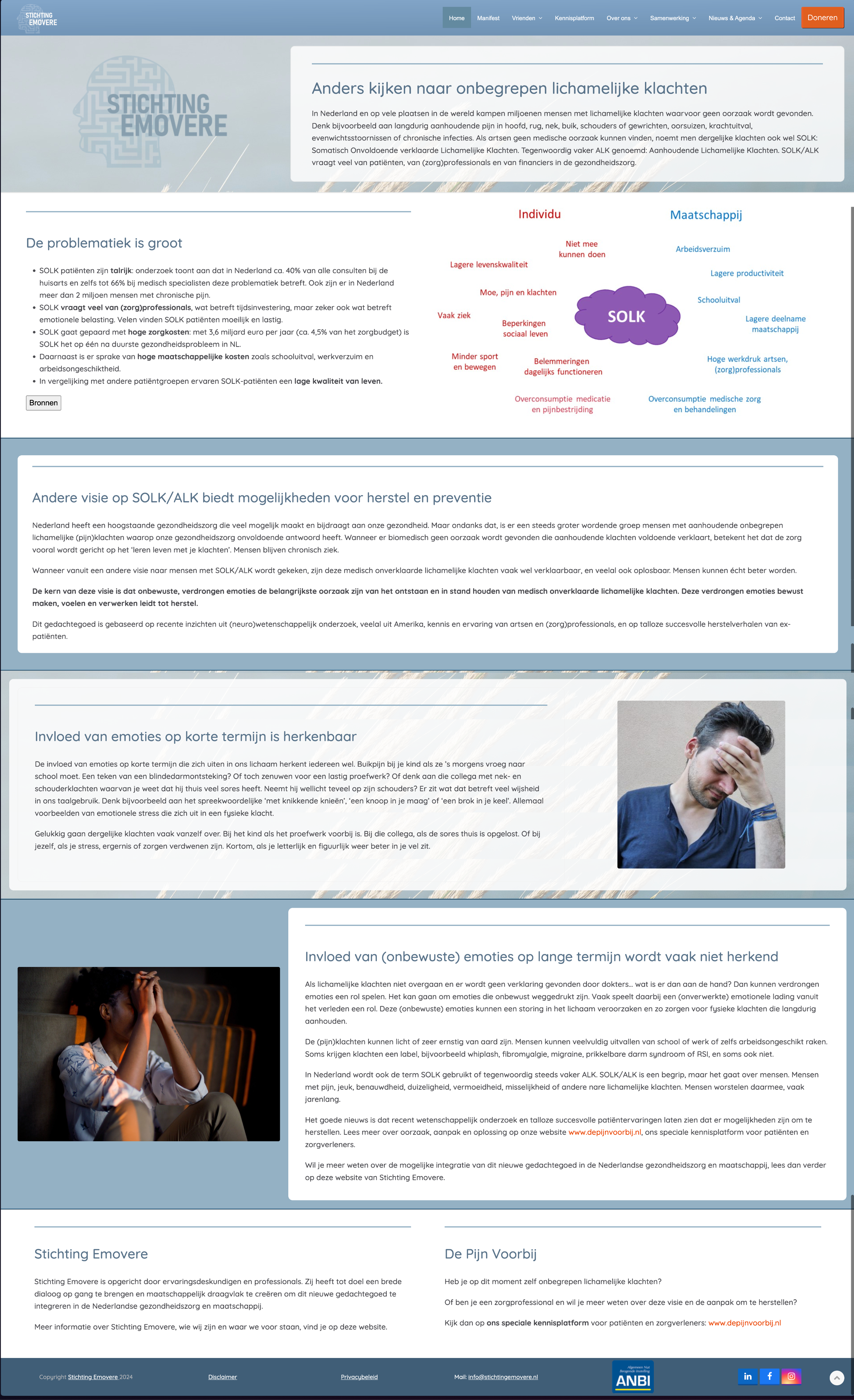
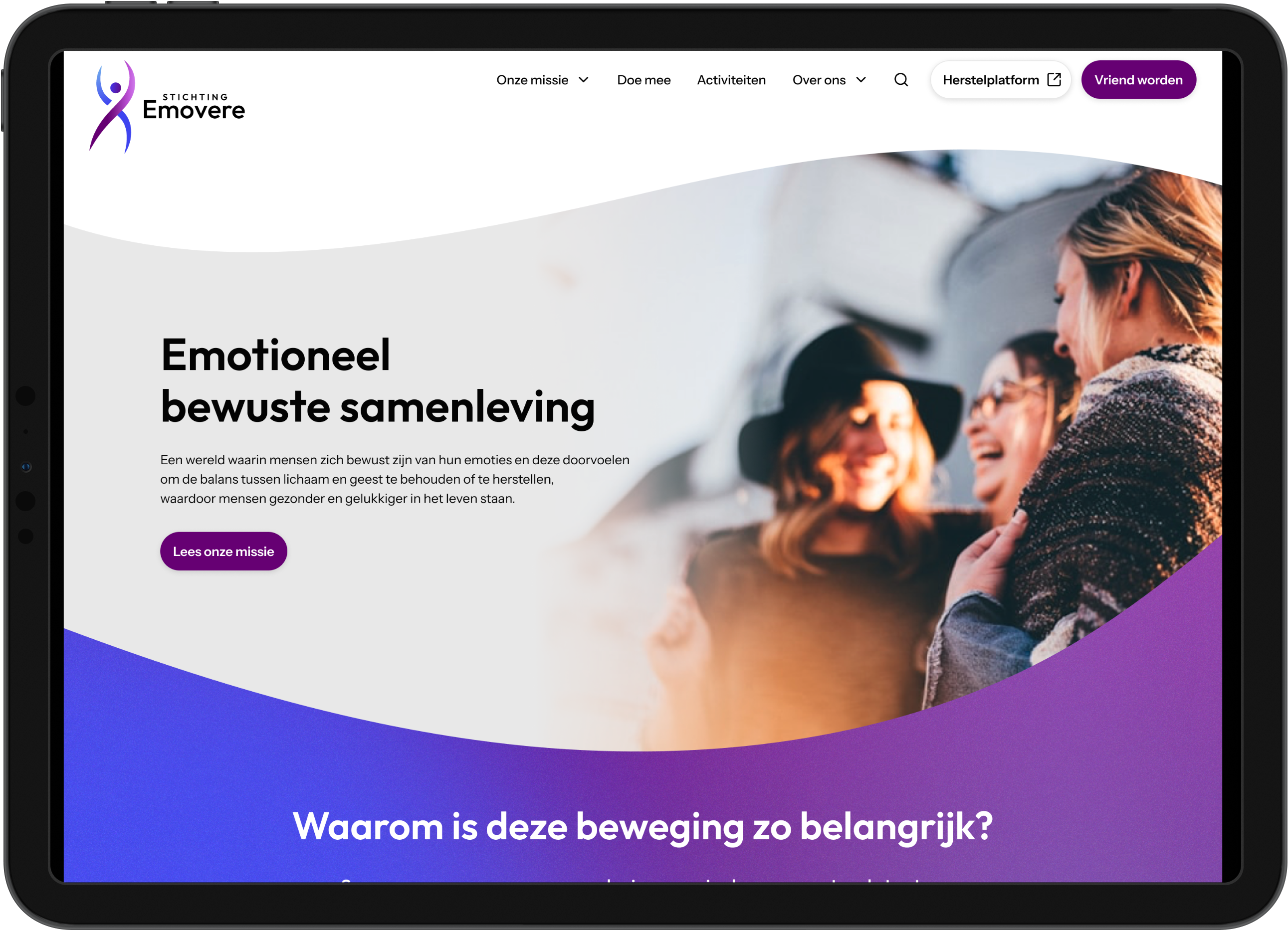
The website had a lot of content that was not clearly presented. For especially new visitors it's not always clear what Stichting Emovere does and how they can help. By simplifying the content and making it more accessible, the website becomes easier to understand and navigate.
Consistency
In the audit I found many inconsistencies in different components. Therefore, I took the time to define a design system that could be used across the entire website. This makes the website look more professional and trustworthy.
Visual hierarchy
Lastly, I want to provide visual hierarchy to make the content and information easier to scan and find. By using different font sizes, weights and colors, the user can quickly understand the structure of the page and find what they are looking for.
Scroll in the frames to view the pages